Declutter mode would make it easier to follow Apple Maps ...
Many iPhone users have a difficult decision to make when traveling; do they use reliable Google Maps to help them get from point "A" to point "B" safely, or do they turn to Apple Maps which
Apple is constantly improving. Either way, both platforms deliver an incredible amount of information to drivers (and passengers since technically you are not allowed to drive while looking at your phone) that might be hard for them to comprehend on a smartphone screen.
Looking to make things easier to understand, per
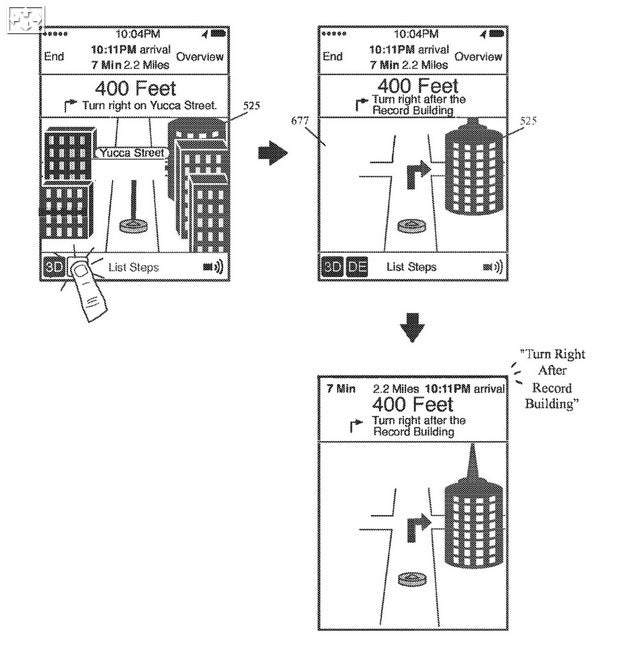
Autoevolution, Apple has filed a patent application titled, "Navigation application with novel declutter mode." This is actually a brilliant idea since it allows an Apple Maps user to press a button on the UI to switch from full mode to declutter mode. The latter would remove all of the names of the restaurants and businesses you pass and focus solely on the route and map information that will take you to your destination.
Besides removing business and restaurant names, the only street names that you will see in declutter mode will be the one you're currently driving on, and the one where you make your next turn. And to make the interface less confusing, there would be no arrows highlighting your journey except for the ones telling you where you make a turn. Voice guidance could also change. So instead of hearing the instruction to "turn right on 3rd Street," you would hear, "turn right after the Bank of America building." At the same time, all buildings except for the Bank of America building would disappear from the screen.

When making a turn, a building could be used as a landmark in declutter mode
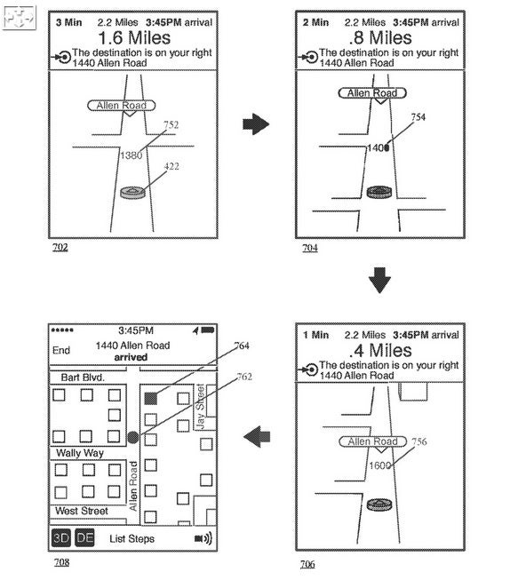
And once you finally arrive at your destination, instead of hearing that "your destination is on the right," a satellite view might appear on your screen to show you precisely where your destination is. The reason why this is such a great idea is that it would focus Apple Maps on getting the user to his destination quickly and without distractions. If the user doesn't mind, the feature can be disabled and the full Apple Maps UI can return with the tap of a button.

Declutter mode UI when arriving at a destination
Since Apple hasn't even received a patent yet for the idea, we don't expect this to be implemented soon. But for those who find it hard sometimes to navigate using Google Maps or even Apple Maps because there is too much information presented on the screen all at once, there might be a solution coming eventually.


